Saturday, May 2, 2009

Blurb.com book review: updated (May 2009)

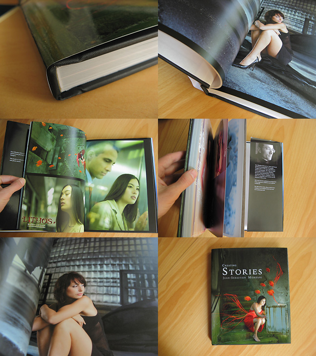
Following up my previous review of blurb.com book, I would like to share with you some of the new features available.

You can now order books with Premium photo paper

This makes a whole difference in print quality. I've ordered a book in November 2008, here are some sample images:


Binding
The new binding is now better, more flat and rigid. However, it "eats" more of the images in the spine, so, be careful when putting elements towards the inner edge of the page.

Print quality has been much improved with Premium paper: lighter tones are less grainy, and the paper (150g / m2) is very pleasant.

Colors fidelity: 5/5 Colors are very good. Not too dark, no wrong colorcast, this is a VERY pleasant. Really, kudos to Blurb - labs who know me can tell you how much I care about it :) Perfect colors and luminosity all the way.

Grainless photo printing: 4/5 Grain is noticable at close inspection but it isn't much of a problem

Compression and artefacts: 4/5 Images are a little soft but it matches the printing quality.

Light tones rendering: 4/5 Light tones are less grainy on premium paper.

Finishing: 5/5 The book looks solid and nice.

Soft-cover version I've tried the soft-cover binding and it is surprisingly solid and cheaper too.

Tuesday, May 27, 2008

Make your own photo book: a review

What can you expect?

Certainly not the same quality as photo prints. It’s a different process which will struggle with subtle light tones. On the other end, there was no evidence of dots in dark areas where black IS black.

The printing quality is on par with entry-level 4-ink printers on a good glossy paper. It’s a little grainy.

Let’s have a detailed look (click on the screenshots)


Here is my review of my first photo book ordered at blurb.com

I’ve finally ordered a 160 pages photo book and I’m rather pleased with the result. For less than 50$ (with shipping to US), it’s OK.


1. Binding

It’s rather good. Of course, if you fully-open the book, there is this little “cracking” but it seems resistant. Pages don’t seem to want to fly away.

2, 3 Closeup

With CMYK ink printing like this, a closeup examination will reveal some dots. Don’t worry! You won’t noticed them much when browsing the book.

4. Compression

No matter how good your images are, Blurb’s software recompresses them to JPEG around ~9 (on 12) quality. I was very worried about this because the lossy JPEG compression introduces artefacts, especially on red tones. To my own surprise, since the printing is grainy, there wasn’t much problems with that.

5. Artefacts?

Texts weren’t producing much artefacts either. There *are* some artefacts but that’s really on tight closeup that you can see them. Still, avoid small texts on JPEGs if you can.

Conclusion

Colors fidelity: 5/5. Colors are very good. Not too dark, no wrong colorcast, this is a VERY pleasant surprise. Really, kudos to Blurb - labs who know me can tell you how much I care about it :) Perfect colors and luminosity all the way.

Grainless photo printing: 3/5 Grain is a little high, but if you don’t bother it should be OK. You know how perfectionist I am: if I say it’s OK, then it’s really OK :) It should be perfectly good for BW prints for instance.

Compression and artefacts: 4/5 Images are a little soft but I’ve got to admit that the compression matches the printing quality.

Light tones rendering: 3/5 Light skin tones can become unfortunately quite grainy. This should be improved. I could give a lower rate but since it only happens on less than 10 pages over 160, I wouldn’t say it’s too common.

Finishing: 5/5 The book looks solid and nice.

Software: 2/5 The software feel rather amateurish, I would much prefer to upload my own PDF. But at least, it didn’t crashed

Overall impression on clients and friends: 5/5 I’ve tested it and both were quite excited and impressed by the book. To me, it’s not as good as photo prints but it was worth it (for the price).

For the moment, it’s the best book offer I’ve seen for the price.

Saturday, March 29, 2008

Bertrand Bitz


Sortie du CD de Bertrand Bitz le 8 avril 2008.
J'ai assuré le design du CD, du site, les photos, etc..

Friday, December 7, 2007

And the ripper's site is down

Following up my previous post, I've managed to bring down the website of the ripper I was talking about yesterday :)

By the way, since it's December, I've got an ongoing Advent Calendar project, together with 23 artists. You can view it on my DeviantArt account.

Thursday, December 6, 2007

This photographer artisticvisionphotography.com is stealing my work

Just a quick note Let me introduce you to M.Raul Sebazco / 321 West 24th St / New York / New York 10011 who is bravely stealing and ripping my work on his website called artisticvisionphotography.com
Now you know why I need to watermark my work :(

Thursday, November 22, 2007

No photo book on Blurb.com and here is why

Hello

Some of you had noticed that I was planning to create a 160 pages photo book at blurb.com. I was quite excited about it.

The first time I made a book with another company resulted in a complete disaster: I had carefully scaled down all of my image to the proper pixel dimensions for the page, saving them with the highest JPEG quality. Guess what? Their software recompressed my images before sending them, with a crappy JPEG quality resulting in ugly JPEG artefacts (see wikipedia if you don't know what it is).

So, of course, I had checked on Blurb website and forums - everything seemed fine, no recompression should be done.

Well, I'm afraid, there IS some recompression even if you create a correct file. Fortunately, I've noticed it while sending 4 times less data that I had expected. Hm. This shouldn't be good.

I've ran some extra tests and spent some more time on it, and here is the result:

  • any file beyond 2 Mb will be recompressed by the application
  • one can assume that JPEG quality 9 – 10 will give a filesize below 2Mb (max quality is JPEG 12)
  • Artifacts quite show up at JPEG quality 9 – they are less noticeable at 10, but 9 is really the moment when you can see them. Especially on detailed red tones and edges of objects.

While probably a lot of images will print more or less correctly, I know that the most detailed ones won't (think of these pics with red umbrellas, red fishes, etc)

Therefore, I don't want you (and me) to pay $40-50 for a book that won't meet my quality standards.

Sure, it's the price of 10 photos for me and I would had got 160 of them (not on photo paper, though). But simply due to tentatives on limiting bandwidth and disk storage, these companies fail on providing a good service.

That is, to say the least, quite stupid.

Tuesday, October 23, 2007

Traditional art and trend in graphic design

Hello my friends,

We have been celebrating yesterday Traditional Art on DeviantArt which was, I think, a good thing as many pieces there are more digital and traditional ones deserve recognition too. Changing our medium offers new ideas, challenges and possibilities - all for good.

I have been noticing for many months how traditional and hand-made/drawn/painted pieces are coming back into graphic design (in a general sense). If we step back, say, 7 years ago in the early 2000, most commercial trendy and cool designs were pure computer-generated stuff. Now, people tend to think that using the computer is too easy and if I consider some of those previously successful designs which were mainly Photoshop filters and various blending modes, I can't say this isn't completely false.

So, where are we now? I think, in the most exciting time: mediums are just mediums: paper, scanner, photoshop, ink... we can print an image and paint on it, scan a drawing and digitally paint on it... that's the time for mix-media. I personally don't care about how many processes are involved, what's important is how the final image will look. I mainly work digitally but this doesn't mean that my images should look digital (think of my paintings for instance).

Now I see on artists blogs, statement such as "[...] when creative design was a more hands-on affair, pens, pencils, [...] allowed designers to express a real individuality in their craft that is not possible with a keyboard and mouse." (this ones come from the cool blog www.cpluv.com ). Well, really, I can't agree. It just seems to me that digital artists are just re-discovering traditional media and feeling excited about it - but this is just a tool!

I've always disagreed with people who think that they know and do "real" art because of the medium they've elected. Like "I shoot film, I'm a real photographer". "I'm using a Leica because all famous photographers had one".

Everything is just a medium. These are just a tools.

It is important to play with them all. Experiment. Gain experience, get ideas, but don't disrespect others' work because they don't use your technique.

You'll get respect by showing some innovative ideas or touching images. But not because you're using a specific medium.

Enjoy and have fun mixing things altogether until you end up with something great and personal.